Download this article in PDF format.
The Internet of Things (IoT) is exploding with estimates of 25 billion connected devices online by 2020, up from 18 billion today. This trend of connecting physical devices is taking off and will change the way we do business, but it’s just in its infancy now. Innovation is happening in a lot of areas of IoT, from cybersecurity to hardware, but one area that doesn’t get as much attention is User Experience (UX). The right user experience creates value for end users by improving usability, accessibility, and interaction.
UX design generally involves a sequence of interactions between a user and a system, virtual or physical. Best practices have been pretty clearly laid out for UX based solely on web and mobile, but throwing in billions of physical devices makes things a little more complex. Here we’ll look into six reasons why designing UX for IoT is so difficult and how to overcome each challenge.
1. Diversity of interfaces and data points
Typically, an IoT solution needs to handle multiple data types from multiple devices on a user interface (UI) that flows seamlessly across interfaces. For example, an IoT solution at a solar power plant might aggregate data from the inverter, weather station, grid pricing, and more. The inverter and weather station would commonly involve “dongle” hardware with a processor and wireless communications chip to pull and send data through a gateway to the cloud. Grid pricing is generally pulled in from the utility via an application programming interface (API).
Once these multiple data types from multiple devices are together, the end user needs to access a simple yet informative visualization on any interface they want, like a phone, laptop, or on-site screen. Different users, such as an owner, financier, and technician, also should only have access to the information they need. With such diversity at many levels, UX design becomes incredibly complex for IoT solutions.
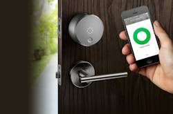
1. Interfaces on the August smart lock and phone maintain a consistent look and feel.
In a simpler home example, a smart lock should have a user interface (UI) that logically connects between interfaces on the device and a smartphone (Fig. 1).
Unification of the feel across interfaces to fit various user experiences is one of the biggest challenges for UX designers in IoT. From a technical perspective, the many interfaces often require UI development in more basic environments, like Linux using more basic languages to code each interface. Having a fancy, modern look is great on a smartphone, but the UX designer must consider how a simple interface on a piece of machinery will align with the experience.
Lastly, IoT systems are always changing with new data points coming online or devices in the field being changed out. Going back to the solar example, if the solar plant is expanded and adds a second inverter of a different brand, this will be a challenge for the underlying data ingestion infrastructure, but also how seamlessly the UI and UX adapt to such a situation that will inevitably happen. With this in mind, any UX developed should be flexible enough to adapt to new contact points and changes in existing devices.
2. Get in deep on hardware
It’s doubtful that UX designers get involved in the technical specs of the iPhone or other consumer hardware that is a big part of common consumer UX solutions. In IoT, hardware selection is also primarily guided by technical specs, software compatibility and costs, but ignores user experience to a large extent. This should not be the case since hardware can have a big impact on user experience.
Selecting the right sensors, processors, and communication modules that fit into an edge device determines how a user can interact with it and when the device is not a super powerful iPhone, these types of things matter. For example, if a certain processor is selected for cost reasons, it may respond very slowly to certain commands or drain the battery very quickly, which could really drag down the user experience with slow speeds and outages.
Pretty design and fancy software will not provide users with a great experience if the underlying hardware is not compatible with that experience. It’s important to consider what is important to the end-user experience when selecting the various hardware components to support a more seamless user experience.
Typical Hardware Selection Criteria
Enough MIPS/RAM/ROM
- Running a real-time operating system (RTOS), or time-based scheduler, would be sufficient for most applications, but it will limit the ability to expand.
A variety of serial interfaces
- Need serial I/O to communicate with peripherals, like GPS, cellular modem, etc.
- Have more than the minimum needed serial interfaces for expandability.
A/D and GPIO
- Analog to digital (A/D) and general-purpose input/output (GPIO) are not a must, but these are features that may be needed in the future.
Durability
- Systems targeted at hobbyists and minicomputer applications may not be rugged enough for field use.
- None of the systems, as built, may be fit for extended use in the field.
Manufacturability
- Meeting field-use environmental conditions (heat, vibration, dust, moisture) may require a custom board, regardless of what is chosen.
- Some systems use components that are difficult to obtain, especially for smaller companies/volumes.
3. Connectivity plays a big role
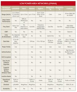
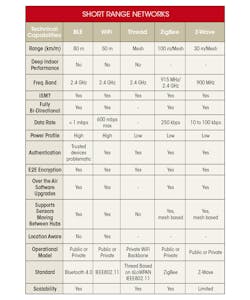
Many different networks connect physical devices—some are fast, some cost a lot, some can only handle limited amounts of data, and on and on (Fig. 2). Choosing the right connectivity option for a specific use case is very important to the experience a user has with an IoT solution. In some situations, low latency and minimal data loss are very important (autonomous vehicles or volcanic activity monitoring), while in others they are less so (solar generation or tide level monitoring). Regardless of how beautiful a UI is, if the data doesn’t get there when needed, it’ll be wasted.
2. Here’s a rundown of common communication technologies, including their tradeoffs. (Source: “How to choose the best connectivity network for your project”)
Another factor to consider along with connectivity is the fact that many IoT solutions are also located out in remote environments. They often use simple devices that can lose connectivity or miss a few data points quite easily. Some connectivity options are more reliable and that can reduce the likelihood of missing data, but UX design should consider how to respond to the inevitability that some field devices may be offline for a short or long period of time.
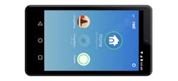
A few routes for handling this include: fake it until data gets through, clearly state that the connection is down and data is missing (see the figure below for an example), or indicate that data is in process until it is accomplished. This type of decision will impact UX and should be based on the situation and use case.
4. Go beyond the basic platform modules
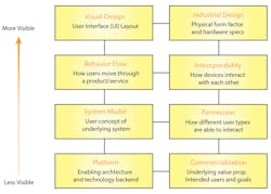
Most IoT solutions start with an IoT platform that allows hardware, connectivity, data collection, analytics, rules, actions, and application development to work seamlessly together and build out a full solution on top of this foundation. For such a solution or product to work, each module, from hardware to analytics to connectivity, plays an important role. UX designers need to understand each module and be aware of how it can affect design. Many of these modules are also not visible to an end user (Fig. 3), which can lead UX designers to only focus on the areas that everyone will see.
3. The Nest UI clearly shows the user that a specific device is offline.
For example, a module that’s not generally visible might be the rules engine. In a smart manufacturing facility, a machine operator may depend on machine performance data and real-time notifications if a rule is triggered in order to fix or avoid any machine issue. While the operator may not care about the how rules are built or what rules are defined, he or she is impacted by both correct rules being set and logical delivery of any notifications that result. If rules are ignored during the design process, the operator may not receive the proper notification and the overall solution’s user experience will suffer. Figure 4 highlights the visibility factors.
4. Visibility of IoT UX elements.
5. Third-party integrations are not seamless
To bring an IoT solution to life, companies almost always need to use components from third-party vendors. Those sensors, processors, controllers, platforms, and applications are likely coming from a variety of vendors, making it difficult to properly integrate them all into a seamless user experience. At the same time, technology is always changing, whether it is older sensor hardware that is replaced or software updated with new patches or versions. The interoperability challenges posed by IoT make great UX all the more difficult.
UX designers should try to incorporate any new components or features into a broader experience rather than creating a piecemeal one. Requiring the user to switch back and forth between two programs or screens will only ruin the user experience.
5. The abundance of smart-home apps that don’t work together leads to a bad user experience. (Source: “For the smart home, how many apps is too many?”)
For example, a smart-home user may operate a smart sound system with one app and smart lights with another, which isn’t a great experience (Fig. 5). In a more extreme example, a smart home may have lighting from several manufacturers that may require the user to operate the lights in a single house using different apps. The ultimate user experience would allow the user to operate each of these devices from within the same app on their phone, tablet, or smart TV. However, this isn’t as easy to accomplish in the consumer space as it can be in industrial implementations.
6. Building trust
In high-leverage situations, it can be hard to trust a green light flashing on a dashboard on our phone saying everything is ok. If you work at a nuclear plant or are monitoring a volcano that’s located just above a town, you might be a little paranoid about how much you trust that little green light. Because IoT marries the real and digital worlds, data being right and wrong can have a significant impact on people, which is why trust must be built into the user experience of IoT solutions.
UX can build trust in several ways. Acknowledgements and status details can go a long way toward helping a user understand what’s happening and feel more comfortable that multiple details all support a resulting green light. Allowing users to dig even further into data can go even further and get a user comfortable with the root of why things look the way they do. While these drilldowns and acknowledgements shouldn’t be forced on a user, they can be very helpful in building trust. This type of transparency is specifically critical for IoT applications and provides a great user experience for high-importance physical data, especially when a user is remote.
Ultimately, when developing an IoT solution, it’s easy for a project team to get into the details of hardware selection, building rules to trigger autonomous actions, and more. But when designing UX for such a project, it is very important to be involved from the beginning and really get into the details of how the solution functions, since it directly impacts the end user experience. More emphasis is already being put on UX (especially on the consumer side), but the industry needs to go beyond simple mobile and web guidelines of years past to build new best practices.


