The National Telecommunications and Information Administration (NTIA) within the U.S. Commerce Department, “manages the Federal Government’s use of the radio spectrum. NTIA establishes policies concerning spectrum assignment, allocation, and use; and provides guidance to the various departments and agencies to ensure that their use of spectrum-dependent systems is consistent with these policies.”1
Key to discharging these responsibilities is a thorough understanding of how the radio spectrum actually is being used. To achieve this, NTIA has been collecting radio spectrum utilization data since 1973. A paper that discussed the spectrum monitoring test methods, the specialized equipment needed to perform the measurements, and the results of several tests was presented at this year’s IEEE EMC Symposium in Denver.
NTIA has developed and continuously refined a mobile measurement system—the Radio Spectrum Measurement Sciences (RSMS) system. Today, the fourth generation RSMS-4 mobile measurement truck provides “state-of-the-art instrumentation, measurement methods, and analysis capabilities.”1
Frequency-Domain Characteristics
Reviewing the test methods developed for earlier surveys is informative because both the level of monitoring detail and the instrumentation used to achieve it have changed over the years. Surveys are conducted by the Institute for Telecommunications Sciences (ITS), a division of the NTIA. As noted in reference 1, use of the RSMS-4 is under the administrative control of the ITS director in coordination with the Office of Spectrum Management (OSM), another part of the NTIA.
The Fundamentals
The ITS 1995 Broadband Spectrum Survey at Denver, Colorado used the first-generation RSMS that had four equipment racks mounted in a shielded enclosure on a truck chassis. The monitoring instrumentation was divided into two sections to cover the Land Mobile Radio (LMR) frequencies from 100 MHz to 1 GHz and high frequencies from 1 GHz to 19.7 GHz.
Each section was based on a 22-GHz HP8566B spectrum analyzer and had separate independent antennas and masts, antenna rotator controllers, RF front ends, and computers. They shared supporting equipment such as a digital oscilloscope, pulse train analyzer, demodulator, modulation domain analyzer, signal generators, power supplies, cables, and connectors.
Many of the more fundamental technical challenges associated with spectrum monitoring are discussed in the report, such as the need to preselect and appropriately attenuate signals. The HP8566B analyzer provided up to 50-dB attenuation, and an ITS-designed circuit added up to 70 dB more. Preselection prevented strong off-tuned signals from overloading the front-end low-noise amplifiers.
Because of cable losses at frequencies above 1 GHz, the high-frequency section’s RF front end was mounted on top of the antenna mast. For the LMR section, the antenna signal was cabled to the RF front end inside the RSMS. Calibration for each section was performed by switching a noise diode in place of the relevant antenna.
1995 Measurements
Up to 32 measurement algorithms were available to choose among, depending on the target signal characteristics. However, as stated in the report, “all of the algorithms are based upon either a frequency sweep across the spectrum of interest or a series of discrete steps across that spectrum.”2
For the 1995 Denver survey, conventional swept operation was used as well as a so-called “m3” type of repeating sweep that updated the current maximum, minimum, and mean power values at each measured frequency. In addition, stepped operation recorded peak values from intermittent transmissions while dwelling on a specific frequency. For example, if the system remained tuned to the frequency of a scanning radar for longer than the period between scans, the RSMS would be guaranteed to receive the maximum power at some point in the scanning cycle.
Many graphs of maximum, mean, and minimum power as functions of frequency were presented in the 1995 report together with interpretation guidance such as found on page C-6, “…there is no way to determine, solely from examination of the maximum curve, how frequently the displayed signals were actually observed.” Throughout the report, it is clear that the granularity of the measurements was constrained by the computer system and test equipment. In particular, the temporal characteristics of spectrum occupancy were lost during the data reduction.
Frequency- and Time-Domain Data
In contrast, the results of the more recent surveys made using RSMS-4 are much more comprehensive, reflecting significantly improved computer and test-equipment capabilities. RSMS-4 uses the original two frequency ranges, which has the benefit of supporting direct comparison with previous survey data. And, the m3 data still is plotted for each measured frequency.
However, what stands out is the multidimensional nature of the signals. Most signals vary with time, and the behavior of this variation is a critical part of the spectrum occupancy picture that was missing in the 1995 report. In addition to the swept and stepped algorithms, RSMS-4 includes an FFT capability. And, because large amounts of computer memory have become available, much more of the raw data can be accumulated for further processing.
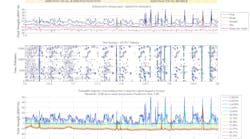
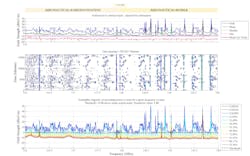
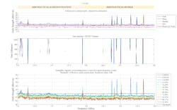
Figure 13 and Figure 23 follow what has become the standard NTIA/ITS spectrum monitoring format of three stacked graphs. In addition to the upper-most m3 graph, which has been extended to include the median value—now m4, two further types of graphs have been developed to present time-dependent and statistical signal behavior. All three graphs make good use of color coding to increase the displayed information density.
Courtesy of IMS
Click here to view a larger size of this image
Courtesy of IMS
Click here to view a larger size of this image
According to reference 1, “The middle graph shows field strength as a function of frequency and time. These [data] are displayed as contour plots having 20 contoured power levels. Red values indicate relative maximum field strength levels, and blue values indicate relative minimum field strength levels.
“The bottom graph shows the complementary cumulative distribution functions of the electric field strength (FS-CCDFs) as a function of frequency. The probability that a measured signal exceeds the specified field strength is shown in the legend. The threshold level (black trace) used to display the time-varying information above the threshold is indicated on the graph as a dashed line. Typically, FS-CCDFs can be used to understand signal types and are useful for displaying the probability that a signal exceeds a certain power or field-strength value. The spacing of the lines gives us an indication as to whether a signal is Gaussian-distributed, continuous wave (CW), or another type.”
Algorithms to Drill Down
Although spectrum monitoring sounds like a very general, broad activity, achieving accurate results depends upon matching signal-processing techniques to specific signal attributes. A 2012 ITS paper discussed the classification of impulsive noise signals and LMR emissions.3 A distinguishing characteristic of impulsive noise is its broadband nature, in contrast to LMR signals that are narrowband. An impulse will distribute energy across a broad spectrum in the frequency domain. Especially for frequencies below 500 MHz, impulsive noise can mask small signals by raising the noise floor.
Of course, the corresponding time-domain signal is short. This means that a swept-tuned spectrum analyzer cannot always correctly measure impulsive noise sources because the impulse duration may be only a fraction of the analyzer’s sweep time. Energy emitted outside of the frequency range swept during the impulse duration will be missed.
Instead, if the signal were captured in the time domain and converted via FFT to the frequency domain, a more representative spectrum should result. In the tests described in reference 3, five successive traces were acquired within 0.9 s, converted to the frequency domain, and analyzed. The total acquisition time is important because typical LMR emissions generally are no shorter than 1.0 s.
Real-time median-of-five processing was performed for each frequency to identify those spectra with higher power levels because of impulsive noise. If only one or two spectra were affected, finding the median automatically removed them from the analysis. If three or more traces were affected, a thresholding technique was used to determine if some percentage of the noise was within 3 dB of the threshold. If so, then the trace was discarded.
The figures demonstrate the degree to which impulsive noise may confuse and obscure test results and also the effectiveness of the described noise-reduction algorithms. In addition to the median-of-five technique, a 50% threshold factor was used for Figure 1. For a trace to be removed from those that had been acquired, at least 50% of the data representing noise must be at least 3 dB larger than the threshold. A high threshold factor identifies traces with significant amounts of impulsive noise. As the middle trace of Figure 1 shows, a large amount of (blue) low-level noise remains.
Changing the factor to 5% means that a trace would be discarded if only 5% of the data representing noise exceeded the threshold by at least 3 dB. A smaller threshold factor is an easier condition to satisfy and removes more traces, resulting in a significantly reduced noise level as seen in Figure 2.
The Figures in Detail
The top chart in a three-high stacked-graph grouping is the easiest to understand. For many frequency bands, a large number of swept-spectrum or FFT measurements are made. The sets of power levels recorded at each frequency are the data from which the maximum, mean, median, and minimum values are extracted. If acquired data is being screened for impulsive noise, those acquisitions so affected are discarded before the statistics are determined.
The second chart is a form of spectrogram and displays power as a function of time and frequency. Time runs along the chart’s Y axis with frequency along the chart’s X axis. The maximum power level at a particular frequency and time is displayed as one of 20 colors to indicate the lowest (blue) signal value or the highest (red). Only signals that exceed a preset threshold are included. This is the reason that an amount of white space exists in the chart.
The third chart requires more background. Starting from the data set of power measurements associated with each frequency, you can generate corresponding probability density functions (PDF) by plotting and scaling histograms of the data. The cumulative distribution function (CDF) is the integral of the PDF, and the complementary CDF or CCDF is equal to 1.0 minus CDF. By definition, the integral of the PDF is equal to 1.0, so the CCDF starts at a probability of 1.0 at less than the lowest power and decreases gradually to 0.0 at a value higher than the highest power.
What does it mean? A point on a CCDF curve relates a power level to the probability that a measurement will be equal to or greater than that power. This is easy to see at the extremes. At the lowest CCDF power level, the CCDF = 1.0: All of the measurements in the data set are larger than that power level. Similarly, at the highest CCDF power level where the CCDF = 0, all of the power measurements are smaller.
To construct the third chart, a CCDF is calculated for the set of power measurements at each frequency. This is the intermediate data used to construct the 12 color-coded traces ranging in probability from 92.36% to 0.0003%. These traces are synthesized from the power levels on each CCDF corresponding to the 12 probabilities.
A couple of examples will help relate the concept to reality. In Figure 1, the second of the three charts shows a virtually constant power transmission at about 117.9 MHz and another at 119.7 MHz. These lines are different colors, there being more blue at 117.9 and more red at 119.7. The peaks of the lowest probability blue curve in the third chart reflect this difference.
However, there are other colors at lower power levels at the same frequencies. The blue peak means that the highest power value occurred very infrequently—maybe just once. The other colors indicate that lower power occurred more often, with dark red meaning that the corresponding power level was exceeded in 92.36% of the measurements.
At 117.9 MHz, 92.36% of the measurements were greater than 5 dB above the threshold, 10% to 20% were around 10 dB larger, and less than 1% were 15 dB above the threshold. Similar reasoning applies to the peak at 119.7 MHz, but here the power is at least 35 dB above the threshold for 92.36% of the measurements. The blue peak is only at about 46 dB, so this transmission varies much less than the other one, and this also can be seen in the second chart, but not quantitatively.
As a further example, the large blue peak in the third chart at about 119.3 MHz is interesting because, in addition to the 0.0003% peak, an aqua trace indicates a lower power occurring about 13% of the time. Indeed, from the second chart, it’s easy to see that the signal is intermittent, at least with respect to the threshold.
Summary
Reference 1 concentrated on the highlights of the research to comply with the 2013 EMC Symposium session schedule. For this paper, comparing spectrum occupancy data gathered at four different sites allowed some of the measurement techniques and data-reduction approaches to be discussed. Marine radar bands clearly weren’t as busy in the Denver charts as in the San Diego data.
However, simply comparing the charts and discussing their differences didn’t do justice to the deeper meaning that they conveyed. If you’re curious to learn more about the work the ITS conducts and the technical details supporting it, a wide range of publications is available.
References
1. Hammerschmidt, C. and Ottke, H., “Spectrum Occupancy Results from Several Surveys,” IEEE EMC 2013 Symposium Proceedings, pp. 76-81.
2. Sanders, F. H. and Lawrence, V. S, “Broadband Spectrum Survey at Denver, Colorado,” NTIA Report 95-321, p. B-1.
3. Ottke, H. and Hammerschmidt, C., “Specialized Algorithms for Spectrum Surveys,” IEEE EMC 2012 Symposium Proceedings, pp. 565-570.


