DASYLab® is easy-to-use software that “lets you interactively develop PC-based data acquisition applications by simply attaching functional icons” according to the datasheet. Nevertheless, easy-to-use doesn’t mean limited. A wealth of functionality is included.
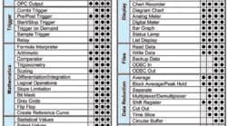
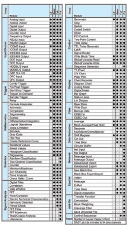
Table 1 lists the major functional groups and the elements within them as well as their availability in the various DASYLab products. Not surprisingly, as you go from Lite to Basic to Full and then Pro, the cost increases significantly.
The demo software I downloaded from the Measurement Computing website was described as being the Full version. I found that it also had most, if not all, of the DASYLab V11 Pro functionality as well as extra options. It’s helpful to explore all the functions even if you only intend to use a small subset. The exercise will determine which level of the program is best for you.
With DASYLab, it really is a matter of working your way through the various functions until you find the one that best fits your needs, and there are a lot of functions. Rather than present a palette of symbols, DASYLab functions are accessed from a collapsible tree-like structure much like in Windows Explorer.
You double-click on a function name to create an icon that you place on the worksheet. This process is continued until you have accumulated the necessary operations. Connecting them is a matter of dragging wires from port to port as appropriate.
At first, I had a great deal of difficulty making the cursor select the wiring tool. If you’re only connecting one port of an icon to one port of another, simply clicking on the output port always provides the wiring tool—a pointed finger with a wire. Just drag the wire over to the selected input port, click on it, and the connection is made. The process is sufficiently smart that even though the wire may cross over several icons while it’s being dragged, when the connection has been made, the wire is neatly routed around the icons and has changed color from a dashed black to solid green.
Connecting a second input port to a previously connected output port was much more difficult. Finally, I discovered that clicking on the corner of a green wire almost always provided the wiring tool. Attempting to wire from the actual output port does not work well if the port already has been connected. Now that I understand how to do this, wiring goes very quickly.
DASYLab block diagrams have a similar appearance to LabVIEW™ virtual instrument (VI) block diagrams, but the two are really very different. National Instruments (NI) owns the LabVIEW and DASYLab products and compares them in the company’s document DASYLab to LabVIEW Migration Guide:
“Although DASYLab and LabVIEW look similar, there are some underlying differences in the design and execution of applications created in these two environments. LabVIEW data wires contain simple data types, like Booleans, strings, floating-point numbers, and integers, as well as arrays and structures of these types that represent any type of information imaginable. DASYLab processes data in defined blocks, which are the result of a measurement or derived data blocks of measurements.
“DASYLab data wires pass complete data blocks, which are complex data structures that contain the measurement data along with additional information such as scan rate and channel information. In LabVIEW, you handle this additional information in the design of the program.” 1
The bottom line is that you can accomplish many things with DASYLab. However, if you need precise control of program execution and the program must have a detailed response to changing conditions, maybe LabVIEW is the better choice. LabVIEW is a complete graphical programming language. DASYLab is a collection of preprogrammed functions. The migration guide concludes, “With [LabVIEW] tools, developers can define a wider range of process, program structures, and functions than is possible in the DASYLab flowchart.”
Attempting to fully describe DASYLab really isn’t possible in a limited space. However, discussing the intricacies of a few examples will demonstrate how DASYLab programs operate.
You must enter values to define the measurement setup. The data block size and sampling rate are two of the more important variables, but you also can program the start time and duration of a measurement and the delay before it repeats again should that be desired. DASYLab processes data in blocks, completing the operations associated with one icon before the block is passed to the next.
For a given sample rate, this means that your DAQ system’s responsiveness varies with block size. If a variable is being used within a control loop, a shorter block size will facilitate faster parameter updates but also a greater processing overhead. Conversely, a large block size is efficient, but visual displays probably won’t operate smoothly. Waveforms will hop from one shape to another rather than transitioning smoothly. You have the choice of block length from 1 to 32,768, mostly in binary steps, but also with a 1-2-5 series of factors such as 20, 50, 100, 200….
Sample rates range from datalogging speeds of a few samples per minute to several megahertz. I accepted the default synchronization selection of a computer clock, but you can choose to have the DAQ hardware sample rate control the system.
Example 1. Stable Triggering
Without an actual DAQ input device, your choice of signal sources is limited. DASYLab provides an externally modulated generator with a selectable wave shape. Alternatively, you can read data from a file. I have a hardware background so I used the generator icon.
The generator is one of several functions that can be defined to have as many as 16 channels. The icon simply grows to accommodate multiple input or output ports as needed. Typically, each channel of an icon is defined separately. You double-click on the icon to open a parameters page on which entries are made and the number of channels adjusted.
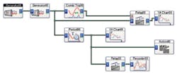
In Figure 1, the left-most generator is the modulation source for the second generator. The scaling of such an arrangement was a bit confusing but once understood is logical. If you wanted the second generator to produce an unmodulated 100-Hz sine, you would set the first generator to zero amplitude—the frequency and waveform don’t matter—and an offset of 100. The first generator’s offset defines the second generator’s carrier frequency. Once that is understood, modulation follows by selecting the wave shape, frequency, and amplitude for the first generator.
I wanted to create a stable trigger and display a trace similar to what you would see on a triggered oscilloscope. Several types of trigger icons are available: combi, pre/post, start/stop, sample, and trigger on demand. Although some characteristics give strong clues, it’s not at all obvious which one to use.
Triggers are not linked to block size. In other words, it’s quite easy to trigger on an event in the first block of data and remain triggered forever. That’s very different from a scope trigger that recognizes an event but then re-arms to look for another similar event after the current sweep or acquisition has completed.
The start/stop icon provides only one or the other function: It starts a trigger or ends one. So, if you want to accomplish both tasks, you need two icons. They each can have separate trigger conditions but can only determine if the data value or slope lies within or without a range defined by an upper and lower limit. Slope is calculated as the difference between successive data values divided by the sample period.
Sample trigger compares the duration of an event to a preprogrammed number of samples. For example, are all the incoming data values higher than a certain threshold for at least 100 consecutive samples? Or, are values still above the threshold but the group is shorter than 100? Like the start/stop trigger, you need separate icons to start and stop the sample trigger.
Trigger on demand monitors the deviation between successive samples. If it exceeds a preprogrammed amount, a trigger event has occurred. The icon output is at zero by default and goes to +5 for both data words associated with the large deviation. This action is repeated for subsequent large deviations. So, it’s possible for the overall trigger event to be several samples wide if the sample-to-sample deviations within a contiguous group exceed the preset value.
The combi trigger seemed closer to what I was looking for and is capable of starting and stopping a trigger in one icon. You can enter separate start and stop threshold values as well as test conditions. Obviously, descriptions must be concise to fit on a parameter panel, but I had some trouble understanding the difference between greater than threshold and threshold exceeded.
Basically, threshold exceeded implies the process of passing through a threshold. Greater than threshold can be a static condition such as 12 is greater than 10. The signal could be a DC level stuck at 12, which is very different than one that increases from a small value and passes through 10.
Using the combi trigger icon with the trigger starting on a 2-V threshold exceeded and stopping on a 0-V threshold undershot produced the type of trigger I wanted. In addition, the combi icon allows pre-trigger and post-trigger selections as well as a minimum trigger width and a reaction time. Because a DASYLab trigger has width, you have to think of the required post-trigger duration being the sum of the width of the trigger and the preprogrammed post-trigger value. Pre-trigger has the usual oscilloscope meaning.
Setting the minimum trigger width is a way to reject stop conditions that follow the start condition very closely. The minimum trigger width actually is an end-of-trigger hold-off delay specified in samples. The reaction time is equivalent to a start-of-trigger hold-off delay.
With the combi trigger, I could develop a stable scope-like trigger with a few provisions. The sum of the pre-trigger, trigger width, and post-trigger samples must be less than or equal to the block length, and the signal frequency must be relatively high. I used a 100-sample block size, 50-sample pre-trigger, and 50-sample minimum trigger width.
As long as the frequency is sufficiently fast that the trigger is stopped within 50 samples of the next trigger start event, everything works as intended. If the signal frequency is too slow, the trigger stays enabled too long, and synchronism is lost.
Finally, the pre-/post-trigger function overcomes the shortcomings of the other icons—shortcomings relative to my application. Again, there is a pair of thresholds. I chose -5 and +2 to define the range. The generator output is a 4-V peak signal so it never exceeds the -5-V threshold. The trigger starts when the signal exceeds the positive threshold—when it is outside the limits.
This trigger function also includes hysteresis, which is key to its operation. I selected -5 V to 0.0 V as the hysteresis range within the limits. As the word is used here, hysteresis means the range within which the signal value must be before the trigger can again be active. This description implies that the trigger event is only a single sample wide. Indeed, this appears to be the case because the system works correctly no matter how low the generator frequency is set.
To recap, the signal is monitored until the value exceeds the +2-V upper threshold. A trigger occurs. The trigger monitoring function then is disabled until the signal value falls within the -5-V to 0.0-V hysteresis range. In the example, the trigger occurs on the rising edge, and the monitoring is enabled later on the following falling edge. I selected a 128-sample block length and a 128-sample post-trigger length. Changing the post-trigger number to 129 loses synchronism. Changing to anything less than 128 simply shortens the length of the displayed trace.
Relay Icon
Generating a trigger is important, but you have to do something with it. The relay icon acts as its name implies, closing or opening in response to a control input. In this case, the trigger signal is used to pass data through the relay and delete data when not triggered. Selecting 128 samples of post-trigger data in the pre-/post-trigger icon effectively makes the output from that module 128 samples long.
It’s important to repeat that triggering is not block related. This means that if a trigger occurs part of the way through a data block, data from the next block would be appended to make up the total 128-sample post-trigger display. The relay module output block length is not the same as its input block length when it’s set to discard data.
The relay module also can be set to replace data with a fixed value rather than discard it. In this case, the input and output block lengths are identical, which negates any trigger synchronization possibilities.
Another module called the action icon provides a means of separating and distributing the control and effect parts of an action. In the action module, you select the receiver—the module that will be acted upon by a specific event. That event also is defined in the action module. When associated with a relay module, the action icon allows a threshold to be set together with a test condition. When the condition is met, the relay can be set to either block or transmit the input data.
Global Variables
Many icons can read and write global variable values. This means that there is an opportunity to adapt the nature of a test program to some external event or to account for past test results. For example, trigger thresholds can be set from a global variable, and you can increment a global variable when an action module condition has been met.
I haven’t explored global variables in depth. DASYLab provides 999 of them so you can create a very complex system if you need to. However, some modules only read global variables when a measurement starts. This wouldn’t be a problem in a system that repeated measurements periodically and the threshold values could be adjusted to track previous test trends.
Example 2: Even Better Stable Triggering
The signal analysis group includes obvious functions such as the FFT, third-octave analysis, a digital filter, and harmonic distortion. Not so obvious is the period check icon. This module, unlike the trigger icons, is block related. It has a couple of operating modes. One looks for the first occurrence of data that exceeds the threshold and then accumulates data after that point until a complete block has been assembled.
In other words, it’s a positive-edge trigger with a one-block post trigger length. This module directly outputs trigger-aligned data assuming you’re OK with a simple positive-edge trigger. Figure 2 includes the period check icon.
The other mode is equally useful if you want to determine frequency. The module calculates it from the overall time required for three successive zero crossings. When the third crossing is detected, the frequency value is output at the location within the block where the crossing occurred. The rest of the block is filled with zeros.
I tried with partial success to recover the generator modulation using this module. The problem was the width of the frequency sample compared to the width of a relay control signal. If successive frequency values could be concatenated with no dead time between, the values actually would constitute samples of the modulated carrier. The carrier frequency could be subtracted from that signal leaving the modulation waveform behind.
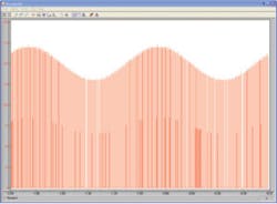
In practice, it wasn’t possible to detect the period check module frequency output with sufficient accuracy to cause the relay module to pass only it and block the zeros to either side. The result was a mix of wanted frequency values as well as unwanted zeros as shown in Figure 3. The carrier frequency was 150 Hz, and it was modulated by a 1-Hz sine with an amplitude of 20.
Display
Several icons are available in the display group including meters, polar charts, lists, bar graphs, and Y/t and X/Y charts. The Y/t chart is constrained only to display equal block length data on all channels. As a result, you generally cannot display both the output from a relay and its input on the same Y/t chart.
The chart recorder module is more flexible and handles a mix of triggered and nontriggered data. Triggered data, as generated by the relay module, contains gaps greater than a sample interval. However, you cannot mix FFT and histogram data in the chart recorder display.
As its name implies, the chart recorder is intended for slow events, and the display time base extends to samples per minute. In contrast, the Y/t display is more like a scope. Its X-axis can be scaled in numbers of blocks or directly in time.
Block size has a direct effect on the responsiveness of a displayed waveform. On the other hand, if a relay module is creating the data actually displayed, it may be discarding lots more data than is being retained. A displayed waveform that updates in large jumps could be caused by the way it’s being generated rather than solely by the choice of block length. In general, shorter blocks are processed more frequently so display updates should be smoother.
Conclusion
I found it straightforward to develop a simple program with DASYLab. Of course, interfacing to real DAQ hardware will add complexity as will the use of more complex functions. Nevertheless, the latest version, V 11, includes sufficient capabilities that it’s well worth considering DASYLab for your next DAQ project.
Reference
1. DASYLab to LabVIEW Migration Guide, http://www.ni.com/pdf/manuals/322221a.pdf
April 2010


