LEDs work because whenever a forward current is flowing through a semiconductor junction diode, each time an electron and a hole recombine, energy is released as a photon. The color of the light is related to the energy of the photon, which is in turn determined by the energy band gap of the semiconductor material. Aluminum gallium arsenide (AlGaAs) yields red, indium gallium nitride (InGaN) yields green, and zinc selenide (ZnSe) yields blue.
This file type includes high resolution graphics and schematics when applicable.
The industry never worked out a satisfactory way to simply combine multiple colored LEDs to produce “white” light. In 1989, though, Isamu Akasaki developed a laboratory process for gallium-nitride (GaN) p-n junction blue/ultraviolet (UV) LEDs. In 1993, Shuji Nakamura developed a commercially viable process for making blue GaN LEDs with very high luminous efficacy—essentially a measure of efficiency in terms of light output in lumens relative to watts input. (For more on luminous efficacy, see “Understanding LED Application Theory And Practice” )
Achieving a blue LED junction with high luminous efficacy became a holy grail for LED researchers because it opened the door to the manufacture of high-brightness (HB) “white” LEDs. HB white diodes combine a blue InGaN diode with one or more yellow phosphors such as cerium-doped yttrium aluminum garnet (Ce3+:YAG) coated on the inside of the device lens. Thus, the eye “sees” photons from the phosphor and perceives them along with photons from the diode junction.
This leads to the use of multiple phosphor layers with different photon energies to spread the emitted spectrum, which results in a more natural lighting effect. Of course, this introduces the question of what’s “natural,” leading to a discussion of color rendering index (CRI) and color temperature.
CRI And Color Temperature
Color temperature relates to the radiation of an ideal black body. It is related to the surface temperature of such a body, expressed in kelvin. It’s common to say that ordinary daylight has a color temperature of approximately 6000 kelvin, although that’s not the actual surface temperature of the sun.
CRI is a measure of how closely the colors of an object being illuminated artificially resemble those colors when they are viewed under actual sunlight. However, the colors created by sunlight vary with time of day. Despite that variability, CRI is the standard used to describe artificial light sources. That may be because, in terms of actual temperature and the light distribution at various frequencies, incandescent lamp filaments behave a lot like ideal black bodies.
CRI is important to color photographers because it makes it possible to design imaging sensors and chemical photographic films, as well as to compare and repeat photographic effects. It’s important in sales and in interior decoration because it affects how people respond to the colors of goods, packaging, and the environments they live in. If people are shooting pictures or video on a cellphone, or displaying products in a store, or setting a mood in a restaurant, they all want their light sources to exhibit a high CRI.
Yet it’s not a perfect world. For the LED maker, a high CRI implies lower luminous efficacy than single-color LEDs. But for natural-looking colors, good CRI is essential, so it presents an engineering tradeoff with luminous efficacy. Happily, Shuji Nakamura gave the makers of HB white LEDs considerably more luminous efficacy than conventional halogen incandescent lamps. The rest of the story is in the phosphors that react to the blue and ultraviolet photons that semiconductor diodes based on his inventions emit.
How Much Phosphor?
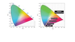
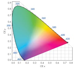
To obtain the specific CRI from a blue/UV diode, it is not enough to simply smear some phosphor on the lens. It is, rather, a matter of just how much phosphor there is in the optical path from the diode junction to the viewer’s eye. To understand this more concretely, it helps to use the International Commission on Illumination (CIE) color space chromaticity diagram (Fig. 1).
The diagram is an empirical description of the effects of color mixing on a generalized model of human vision.3 Each point along the curved edge of the gamut represents a color of a specific wavelength. Moving in from the edge toward the center of the diagram, color saturation decreases until, at the center of the diagram, a dimensionless spot represents “white” light, where all hues are represented.
Making “White” Light
Offsetting the blue of the LED is a matter of managing additive complementary colors, so it requires a phosphor, the saturated color of which lies on a line on the chromaticity diagram between the blue of the LED and the color of the phosphor and passes as closely as possible through the white point of the diagram.
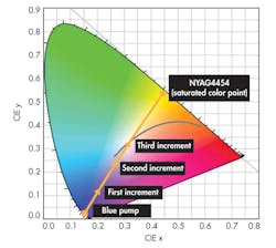
In an article titled “Considerations for Blending LED Phosphors,” Intematix uses NYAG4454, a YAG-based (yttrium aluminum garnet) phosphor that complements blue LED chips with outputs ranging from 455 nm to 470 nm.3 The ultraviolet radiation from the LED junction adds to the output of the phosphor, but it does not significantly affect what the apparent color because the UV is all but invisible to most people.
Aiming for a “warm” or “cold” white light is where the amount of phosphor comes in. More phosphor in the optical path shifts the color point towards the saturated phosphor’s coordinates (a warmer light). Less shifts it toward the blue of the LED, i.e., “cooler” (Fig. 2). The LED itself exhibits a 454-nm dominant blue wavelength on the chromaticity diagram at approximate coordinates x = 0.154 and y = 0.025.
There are five points on the diagram, a starting value, and three incremental additions of NYAG4454. Each addition shifts the color point towards a saturation value at (x = 0.444, y = 0.536). The first data point is definitely cool, the second is somewhat warm r, and the third is a good approximation of “white” light. The gray curve is the chromaticity diagram’s black body locus, with points representing color temperatures from 5000 to 6200 K.
Further complexity arises when phosphors are blended, although Intematix says that color temperatures of 4000 K and higher are attainable with a single phosphor. On the other hand, color temperatures lower than 4000 K cannot generally be achieved with a single phosphor.
About the Author

Don Tuite
Don Tuite (retired) writes about Analog and Power issues for Electronic Design’s magazine and website. He has a BSEE and an M.S in Technical Communication, and has worked for companies in aerospace, broadcasting, test equipment, semiconductors, publishing, and media relations, focusing on developing insights that link technology, business, and communications. Don is also a ham radio operator (NR7X), private pilot, and motorcycle rider, and he’s not half bad on the 5-string banjo.


